Android used to have an opaque black background for the status bar as well as the navigation bar. Eventually, it caught up with iOS and today the status bar typically matches the color of an app’s background. So does the navigation bar, but in some apps it still has a black background. Android 14 brings a new feature to tackle this, called transparent navigation bar.
This is probably meant for developers to easily test what their apps look like with a transparent navigation bar. Or perhaps, it is a feature Google is still testing. Because as of Android 14 beta 2, Transparent navigation bar is hidden in Developer options. For those unaware, Developer options themselves are a set of options on Android for developers that are literally hidden by default.
Enable Transparent Navigation Bar on Android
Before you can enable anything, you have to enable Developer options.

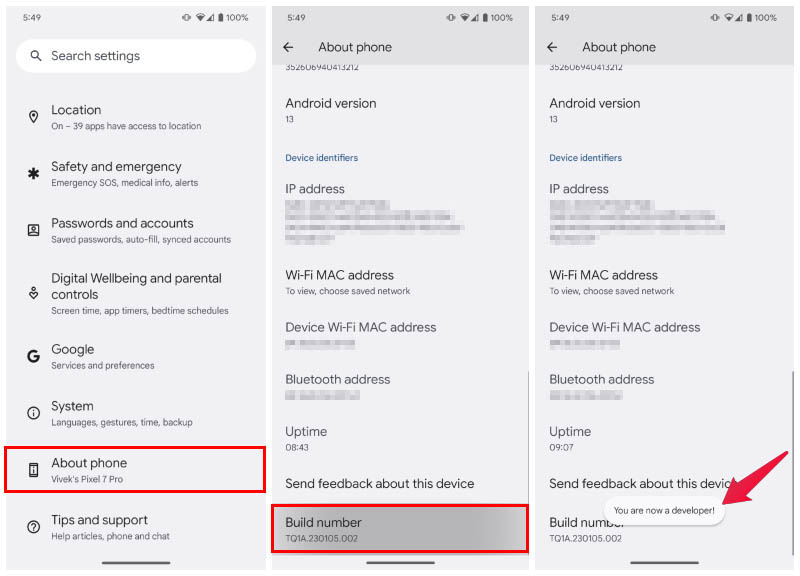
- Open Settings and scroll down to the bottom.
- Select About phone.
- Tap on Build number repeatedly up to 7 times.
- Enter your PIN, password or pattern when prompted.
- You should now see a toast message saying “You are now a developer!”
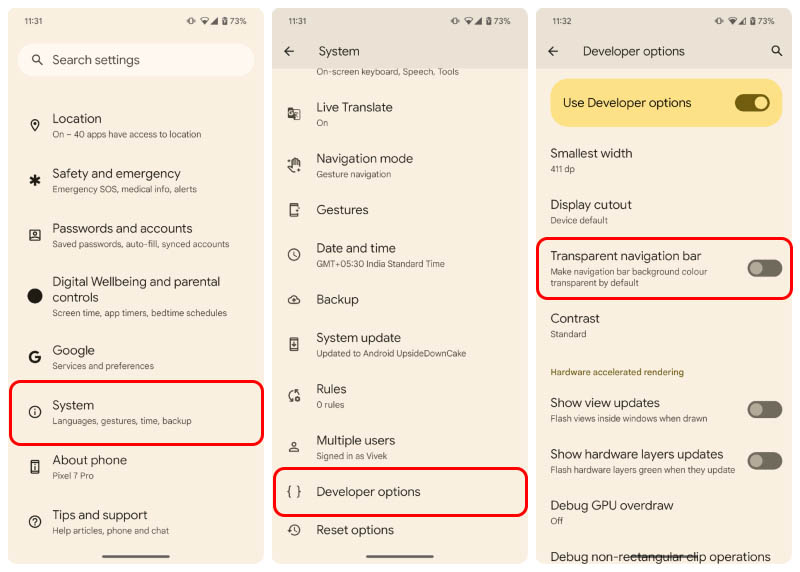
- Go back to the Settings page and select System.
- Tap on Developer options that you should now see towards the bottom of the page.
- Scroll down to find Transparent navigation bar or search for it using the search function.
- Toggle on the option.

Once you toggle it on, you will no longer have a black bar at the bottom in applications that did not draw behind the navigation bar before. You will only notice a difference if you actually noticed the black bars at the bottom before. You can see a before and after screenshot of the BookMyShow app below.

Not only is the black bar at the bottom not aesthetically pleasing, and inconsistent with the rest of the UI, it also breaks the immersive experience. The displays on almost every phone today have rounded corners, with black bezels. If you’re using the light mode, all the apps have light, mostly white backgrounds. This causes a sharp distinction between the bezels and the screen with rounded corners. With a black bar at the bottom though, especially on AMOLED displays, it almost seems like the bottom part of the display is not rounded in the corners.

Back in the old days with Android Kitkat, Lollipop, Marshmallow, black navigation bars were the norm. People like me used rooting and Xposed modules to get a more refined, iPhone like experience. Fortunately, you don’t need any of that today. Although, there are still some apps that don’t play nice with the Android navigation bar. For those apps, you now have a built-in option in Android 14.
